The CE team was using a Hangry App to handle replacement orders. It took up to 10 minutes per order. I designed an internal ops dashboard built around how they actually worked. Then, replacement order time 70% faster.
RoleResearch, user interview, product thinking, writing UX copy, design
Team1 designer, 1 PM, 2 engineers
ProductInternal Ops Dashboard
OutcomeReplacement time 70% faster
Background
Hangry isn't a typical F&B brand. It's a cloud kitchen. One physical outlet running multiple distinct brands simultaneously, each with its own menu, its own presence on GrabFood, GoFood, and ShopeeFood, and its own operational identity. By 2024, that model had scaled to over 150 outlets across Jakarta.
That complexity doesn't show up in the consumer experience. It shows up in operations. And consumer-facing tools, including Hangry's own app, were never built to handle it. Internal Ops Dashboard exists to fill that gap: an internal platform built specifically for how Hangry actually works.
This case study is about one module inside Internal Ops Dashboard: the replacement order tool. When a customer complaint qualifies for a food replacement, the CE team needs to act quickly and accurately. Before this existed, they were doing it through the Hangry App. That's where the problem started.
Research & Discovery
The brief came in October 2024. The CE team, ten agents, was handling food replacement orders every week across all of Hangry's brands, outlets, and sales channels. Every complaint that qualified for a replacement had to be handled individually.
I talked to Regina, the CE team leader. What surprised me most wasn't the volume. It was the time. One replacement order, done through the Hangry App, took up to ten minutes.
Regina called it a pain point. That felt like an understatement.
Time per replacement order~10 minUsing the Hangry App, a consumer product never built for this workflow.
Replacements per week150–200Hangry runs multiple brands across 150+ outlets on three platforms, complaints come from everywhere.
Problem Framing
Using the Hangry App for replacement orders wasn't just slow. It was the wrong tool for the job. The more I understood how Hangry's business actually worked, the clearer that became.
Four structural problems, all rooted in the same thing: a consumer product being asked to do something it was never designed for.
Problem 1
Menu coverage gap
Hangry App only shows menus sold directly to consumers. Items exclusive to GrabFood, GoFood, or ShopeeFood don't exist there.
When a menu wasn't available, CE reached out to the outlet directly, disrupting kitchen operations in the process.
Problem 2
Sub-brand gap
Hangry's sub-brands only exist on third-party platforms. Some sub-brand items appear under the main brand in the Hangry App, but many don't.
Same workaround. Reach out to the outlet directly, same disruption.
Problem 3
Pricing gap
The Hangry App shows consumer-facing prices. Every replacement placed through it was charged at full retail. No way to use internal pricing or COGS.
Every replacement cost more than it should have.
Problem 4
No centralization
Each CE agent used their own Hangry App account. There was no shared view. No way to track orders, monitor volume, or control costs across the team.
Regina had no visibility into what her team was doing.
Decision & Thinking
The PM's brief came with a proposed direction: a form that CE fills to place a replacement order, with part of it shared to the customer to input their delivery address and location. A stakeholder also suggested extending this into a WhatsApp bot.
I mapped out both flows before we sat down together: me, the PM, and the engineers. Not to commit to either direction, but to have something concrete to pressure-test.
We ran them against four constraints.
Option
CE problem solved
Cost reduced
Low user effort
Low tech effort
WA Bot + Internal Ops Dashboard + Share Form
Yes
Yes
No
No
Internal Ops Dashboard + Share Form
Yes
Yes
No
Yes
Both options fail on low user effort. Customer still has to fill the form and pin point their location.
The second option was closer. It solved the CE problem, reduced cost through internal pricing, and kept tech effort low. But both options failed on the same constraint: user effort. In both cases, the customer still had to fill part of the form and pin point their own location.
These are customers who just had a bad experience. Asking them to do anything extra adds friction to a moment where trust is already thin. We almost pushed through anyway, with CE compensating by handling as much as possible. But something stopped me.
I remembered building the location flow for the Hangry App. The pin point feature we used there was powered by a paid mapping service. A fifth constraint had just appeared: no added business cost. And with that, the second option was no longer failing on one constraint, it was failing on two.
Option
CE problem solved
Cost reduced
Low user effort
Low tech effort
No added business cost
WA Bot + Internal Ops Dashboard + Share Form
Yes
Yes
No
No
No
Internal Ops Dashboard + Share Form
Yes
Yes
No
Yes
No
With a fifth constraint added, the remaining option now fails on two counts. Not one.
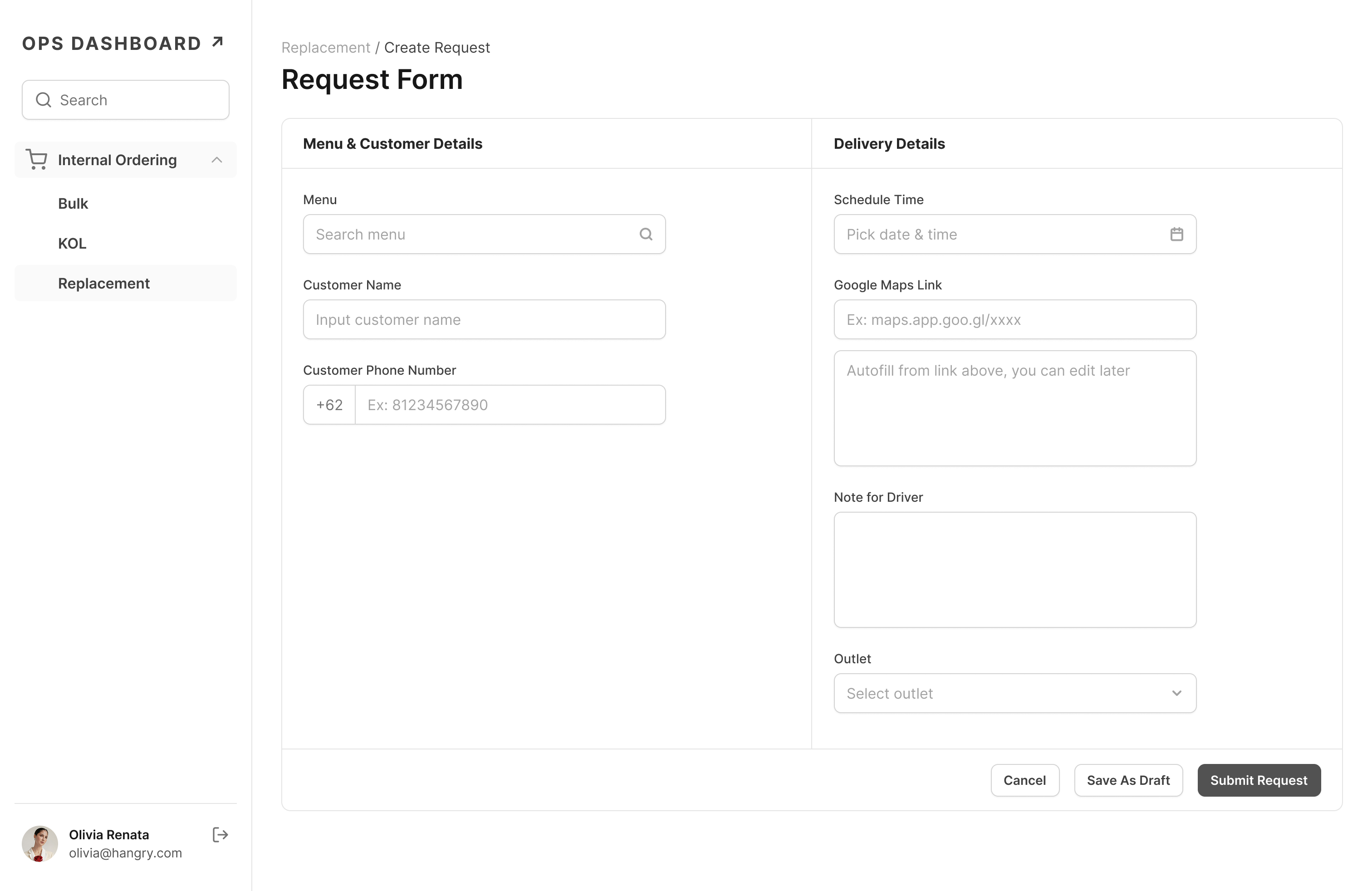
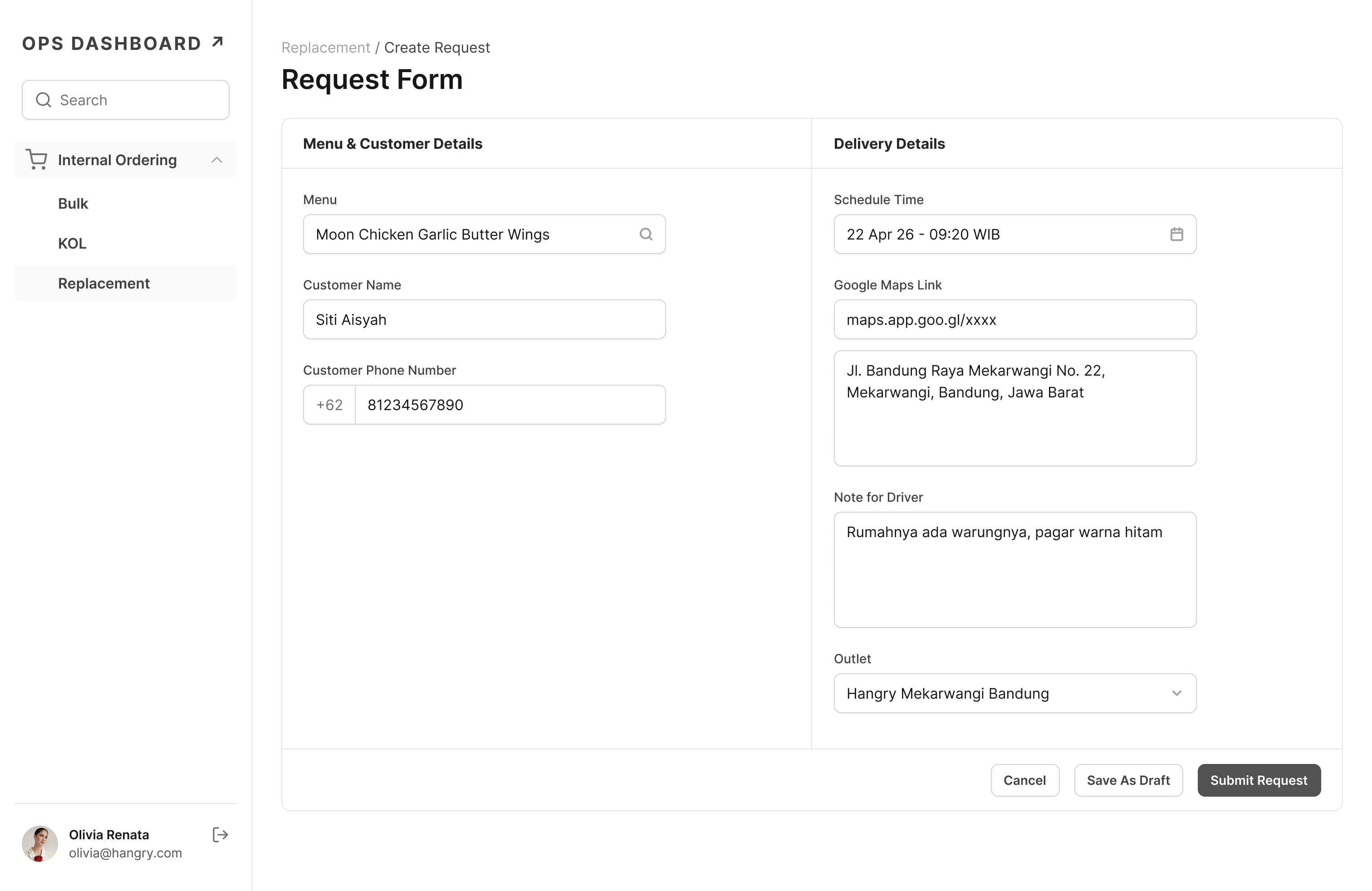
That's when the Google Maps link idea came up. Share links already contain latitude and longitude data. CE could simply ask the customer to share their Google Maps location. No form to fill, no pin point to drag, no paid service. We checked it together. It worked, it was free, and it removed the last burden from the customer entirely.
All five constraints satisfied. We had our solution.
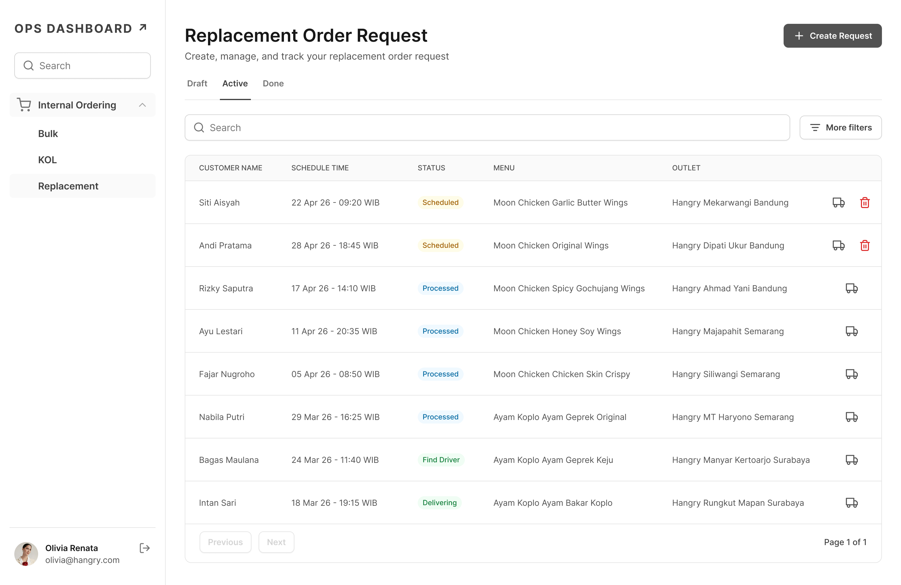
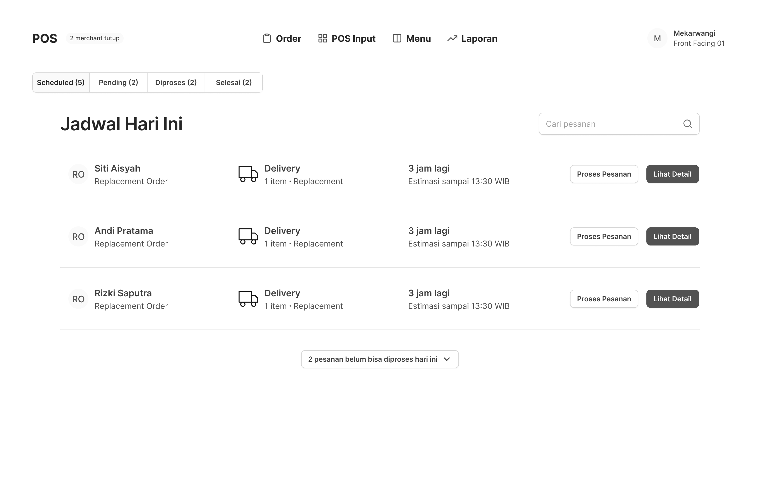
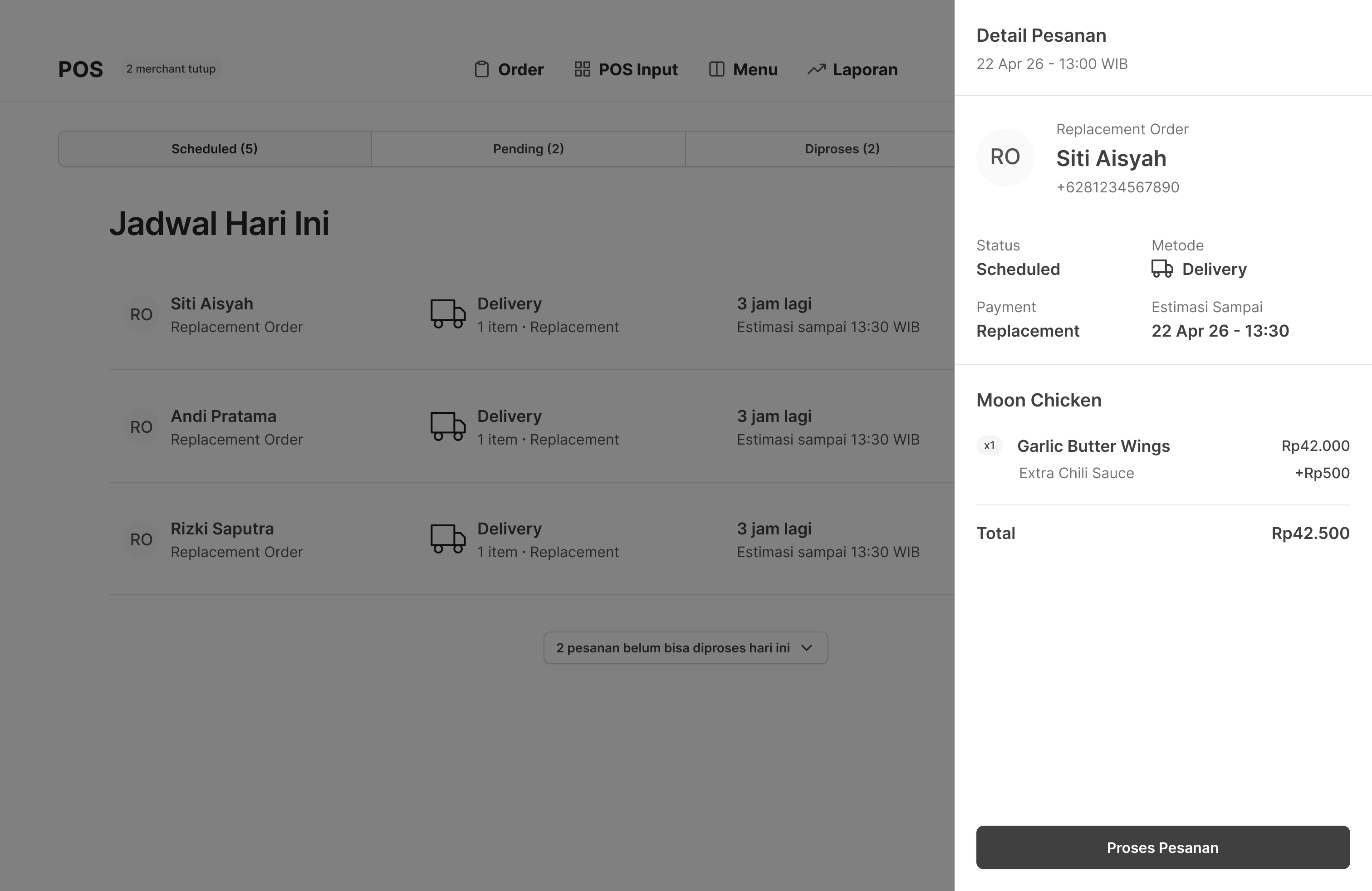
Here's what that translated to in practice, the replacement order form inside Internal Ops Dashboard that CE uses to place orders, and the scheduled order tab added to the POS so outlets can process them.
UI screens have been reskinned for confidentiality. Structure and functionality reflect the actual product.
Internal Ops Dashboard
POS
Outcome
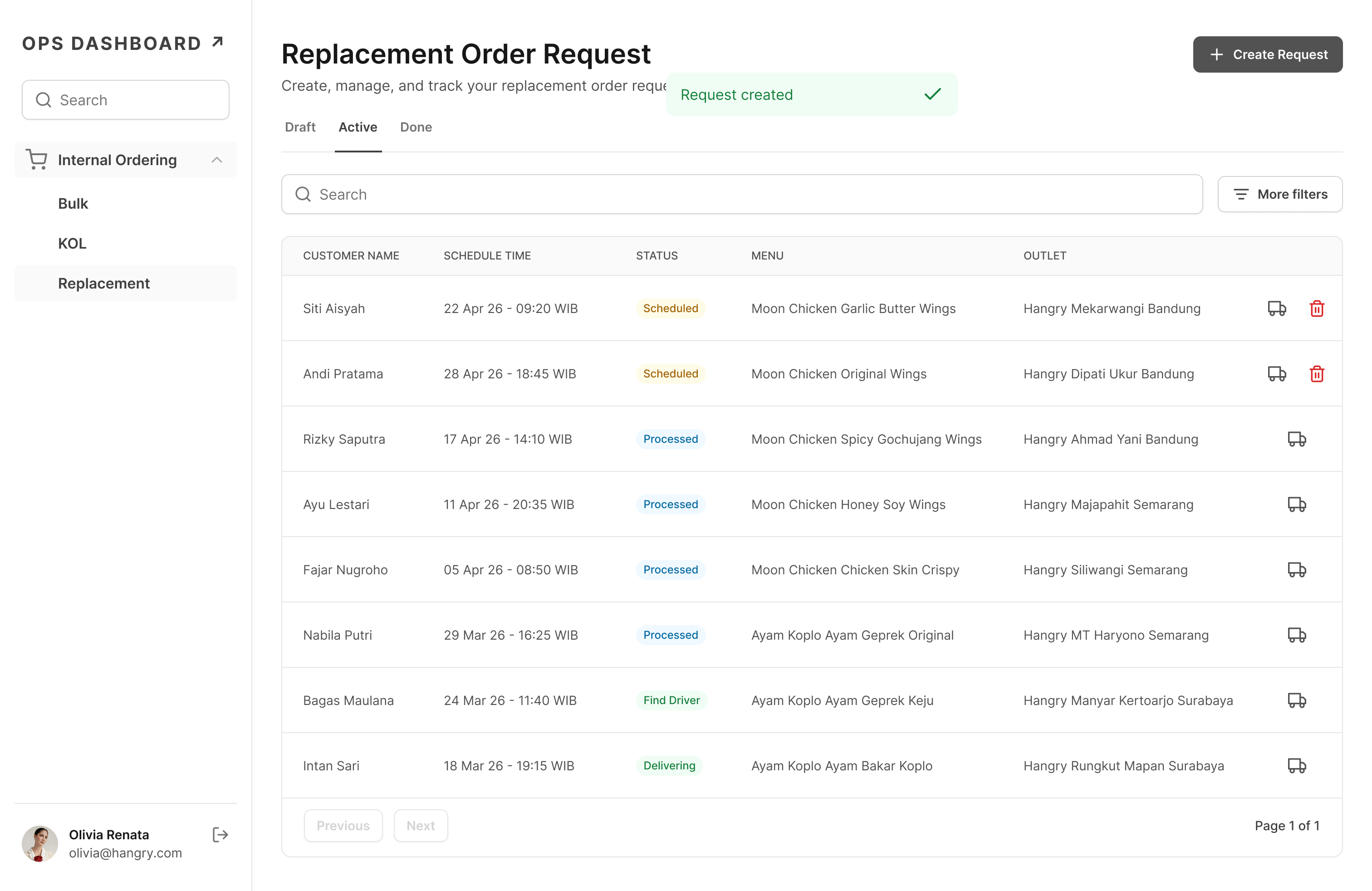
The module shipped in February 2025. A few weeks after launch, I checked back in with Regina.
The feedback was straightforward: the tool was stable, almost no issues after the early bugs were ironed out. But the number that stuck with me was the time.
Before10 minPer replacement order via Hangry App
After2–3 minPer replacement order via Internal Ops Dashboard
Replacement workload↓ 60%Reduction in workload on replacement tasks, per Regina, CE team leader.
Regina put it plainly: if the team was still using the Hangry App, her agents would be screaming. The centralization meant she could actually see what was happening across the team, something that simply wasn't possible before.
The cost side was harder to quantify precisely, but the structural shift was clear: replacement orders were no longer being placed at consumer-facing prices. Internal pricing through Internal Ops Dashboard meant every replacement cost less than it would have through the Hangry App, by design, not by accident.
What I learned
Two things stayed with me after this project.
The Google Maps link idea didn't come from a brainstorm. It came from knowing. From a previous project, that proper pin point accuracy requires a paid mapping service. Right call for a consumer app. Wrong call here. Knowing what the right answer looks like in one context helped me see why it was the wrong answer in another.
Good solutions don't always come from thinking harder. Sometimes they come from remembering further.
The other shift was about emotional context. Asking a disappointed customer to fill out a form and locate themselves on a map isn't just inconvenient. It adds friction to a moment where trust is already thin. That's not a UX problem. It's a people problem. And it changes what you build.
Sometimes the most important thing you can know about a user isn't what they need. It's how they feel when they need it.