Hangry ran multiple brands out of one kitchen. I started by understanding that distinction before drawing a single screen. After launch, it reached 4.9 stars with 100K+ downloads.
RoleResearch, user interview, writing UX copy, design
Team1 designer, 2 engineers
ProductHangry App (Discovery)
Outcome4.9 stars, 100K+ downloads
Background
Hangry App is a cloud kitchen: one physical outlet, multiple brands. From a single location, users can order from all available brands at once. This is fundamentally different from conventional food apps where one outlet equals one brand, one type of menu.
When I joined in 2019, Hangry had only 3 outlets and 3 brands, all in Jakarta. I was the only full-time designer. An existing design was already in place from a part-time designer.
Research & Discovery
Before touching the existing design, I spent time understanding what Hangry actually was.
I came in knowing three things: Hangry had 3 brands, 3 locations, and a food delivery app. That felt familiar enough. Most food delivery apps in Indonesia follow the same pattern — GoFood, GrabFood, or F&B brands with their own app. I assumed Hangry was some version of that.
So instead of jumping straight into the design, I did what I always do first: I talked to people. Stakeholders, C-level, anyone who could tell me what this product was actually supposed to be and where it was going.
That's when the picture shifted. Those 3 brands weren't in 3 separate locations. They were all in the same kitchen, the same outlet. One physical space running multiple distinct brands simultaneously.
There was no blueprint for that in the industry. Not in GoFood. Not in GrabFood. Not in any F&B app I knew at the time.
I sat with that for a while before going back to the existing design. And when I did, I saw it differently, not as a food delivery app with some rough edges, but as a design built on the wrong mental model of what Hangry was.
Problem Framing
When I went back to the existing design, I wasn't looking at it the same way anymore.
Before the research, it looked fine. A food delivery app that shows you restaurants and lets you order. Nothing obviously wrong.
The original design files are no longer accessible, the previous designer worked in Adobe XD and the files were never handed over. What I'm describing here is reconstructed from memory and the reasoning that followed.
But now I knew what Hangry actually was, and the design didn't reflect that at all.
The first problem was identity. The existing design presented Hangry like one restaurant with a wide menu. Scroll through, pick something, order. That mental model made sense for most food apps. It made no sense for Hangry, where every brand was distinct, had its own name, its own personality, its own reason to exist. Collapsing them into one undifferentiated list meant users would never understand what they were actually using, or why they should care.
The second problem was access. The design used a location-first pattern: if you were too far from an outlet, you couldn't enter the app at all. For a product trying to build brand awareness in a city where it had only 3 outlets, that meant most of Jakarta hit a wall before they ever saw a single brand.
Two problems. Both invisible until you understood the business first.
Problem 1
Identity
The design collapsed all brands into one undifferentiated list — like one restaurant with a wide menu.
Users never understood what Hangry actually was.
Problem 2
Access
Location block cut users off before they could see a single brand — if too far, the app showed nothing.
Most of Jakarta hit a wall before ever seeing what Hangry offered.
Decision & Thinking
The existing design blocked users based on distance. If no outlet was within range, users couldn't enter the app at all.
For GoFood or GrabFood, that makes sense — if nothing can deliver to you, there's nothing to show. But Hangry wasn't that. Hangry was a brand story that hadn't been told yet.
My background is in copywriting. One thing that gets drilled into you in that world: conversion doesn't start at the moment of purchase. It starts the moment someone becomes aware a brand exists. The sequence is always the same — you can't buy something you've never heard of.
Blocking users who couldn't order didn't just lose a sale. It made sure those users would never have a reason to come back.
So I framed it this way: we might miss a sales opportunity today, but we didn't have to miss a brand awareness opportunity. Those are two different things, and only one of them was actually within our control at that moment.
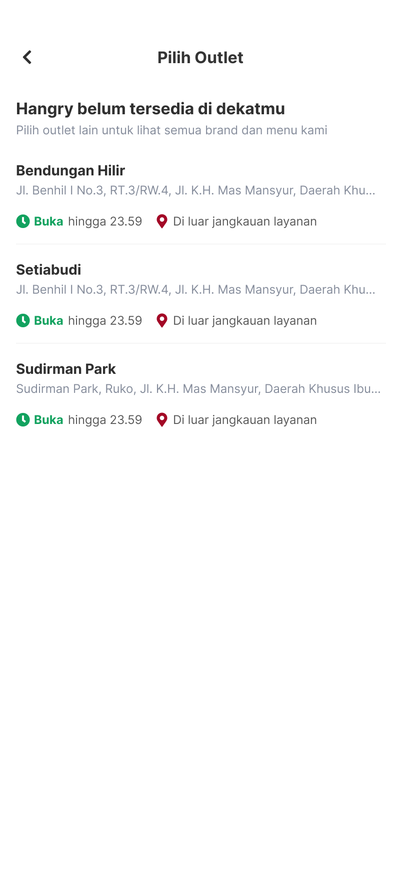
The proposal was straightforward from there. The app still reads location, that part stays. But instead of a hard block, users see available outlets. If nothing's in range, they can still browse every brand, see full menus, understand what Hangry is. They just can't check out, and that's communicated clearly from the start.
Not being able to order today doesn't mean not being able to order ever. But never knowing the brand exists? That's permanent.
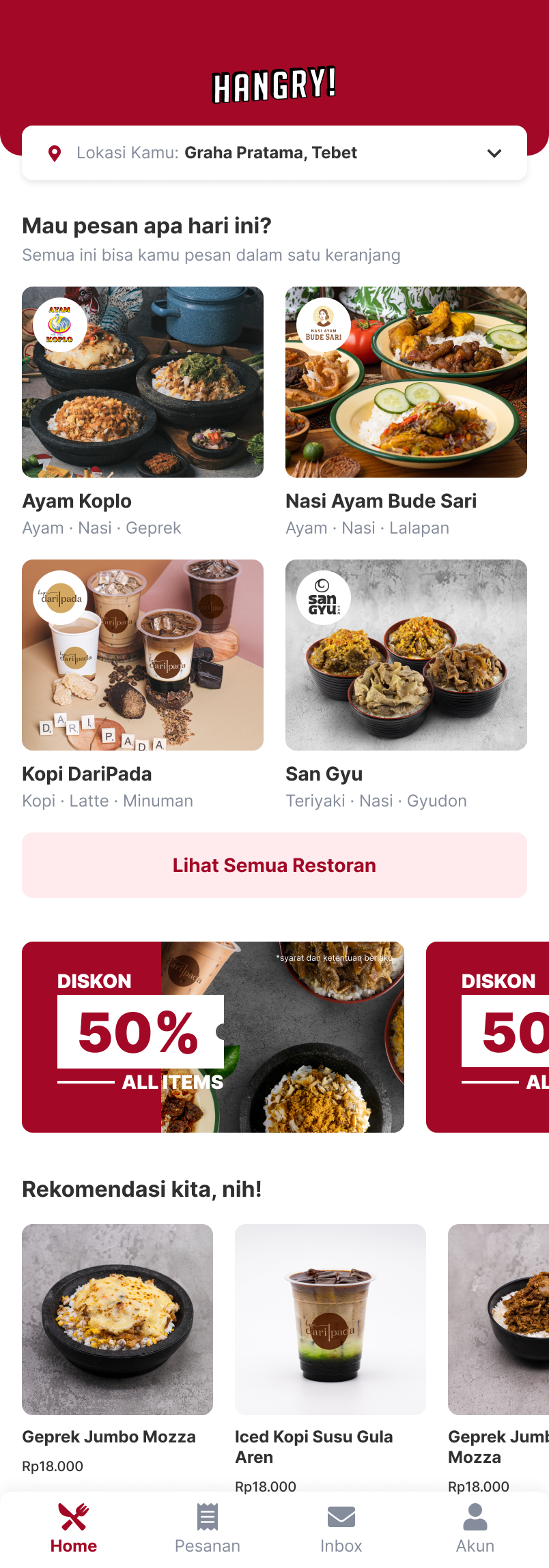
Here's what that looked like in practice, the new access flow on the left, and the home UI that answered the identity problem on the right.
How I Solve Problem 2 — Access
New flow when outlet is out of range
How I Solve Problem 1 — Identity
Home UI showing distinct brands
Final UI — Hangry App
Outcome
The first launch went well. Early Google Play reviews came in consistently: easy to use, smooth, clear choices, seamless from order to pick-up.
JK
Justina Kristianti
May 4, 2020
★★★★★
Very coooll!
1 person found this helpful
MS
Mario Simamora
August 21, 2020
★★★★★
First order & very satisfied! Keep a great work ya
2 people found this helpful
DK
Dessy Kristiana
December 14, 2020
★★★★★
Pilihannya jelas, proses order sampai pick up lancar jaya. Bravo Hangry.
JT
Jennifer Tan
May 4, 2020
★★★★★
Easy to use! Really smooth! Thanks Hangry for making this easy and useful apps!
5 people found this helpful
After the first launch, the Hangry App kept being iterated and the design kept updating, but this experience remained the same.
By the end of 2020, Hangry went from 3 outlets to over 40, growing faster than almost any F&B startup in Indonesia at the time. A product that clearly communicates what it is and doesn't block the people it's trying to reach is part of how you get there.
The obvious lesson was tactical: products in the same industry don't share the same user journey. Everything depends on how the business works and what constraints it has at that specific phase.
But the deeper shift was in how I think about constraints. Before this project, a product limitation felt like a design problem to solve around. After it, I started seeing constraints differently, not as walls, but as context. The question is no longer:
"How do I hide this limitation from the user?"
But:
"Given where this product is right now, what's the most honest and useful experience I can design?"
That reframe changed how I approached every project after this one.